We here at De-Fi have a background in making complex electro-mechanical devices that have to interact with computers. There are universal product development disciplines to accomplish this that we’ve taken into furniture design, and the foundation of what we develop for the customer is often the user story (more here). In this series we’re going to explore actual user stories that we created based on feedback, and how they drove development.
This week’s user story, and one of the reasons we used to justify doing the first Platform is (verbatim from the specification):
- Growing up, the piano I learned on was a centerpiece in our living room, I wish my production studio desk could be that.
Much like last week’s story, this story doesn’t really address workflow or ergonomics, but went a very long way in prioritizing industrial design and the materials used when developing the Studio Collection. We’re pretty confident we nailed this one, if for no other reason than Apple keeps using Platform as the centerpiece to all their lifestyle studio launches.

Screenshot from Apple Keynote
Pianos have been and currently are the centerpieces of a lot of shared living and family rooms. Not only are they instruments, they’re statement pieces of furniture. For a lot of people it’s a calculated signal that they value music and the arts, even if they don’t play. For the most part, they’re also very hard to miss when you walk into a room. Even if it’s just an upright on a wall and not a grand in the middle of the room, it will be noticed. No one on a whim decides to put a grand, baby grand, or upright in a room. Even if it’s gifted, you have to decide you want to deal with the logistics of having something that big and heavy. Also, no one frowns upon having a piano in a room, there is no stigma–no one will judge you for having a piano in a shared living space.
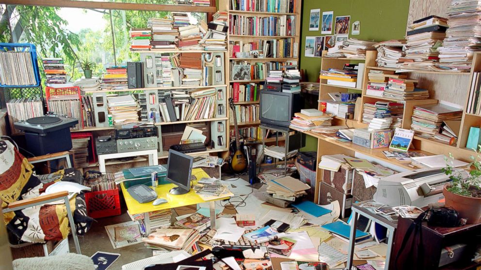
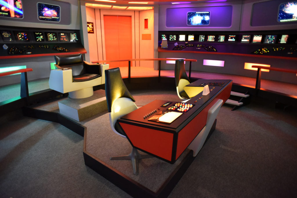
Unfortunately for us gear nerds, that lack of stigma is not really the case with a space shuttle looking home studio setup. The same people, let’s call them production civilians, who aren’t nearly as excited about your Soundcloud as you are, who may actually be impressed by finding a piano in your great room, most likely won’t be impressed with a gamer looking cable spaghetti production setup in the same room. Most of us kind of intrinsically know that, but we also don’t want to hide our passion, or simply don’t have anywhere else to put it. I’d also hazard a guess that there are a lot more aspiring young producers right now than pianists, so we felt the need to give them some love.
A music production desk to replace a piano idea manifested itself not only in the look and shape of Platform, but we needed to define what aspects of a piano could be defined and applied to a desk, and settled on the following:
- Material - Pianos are made of natural materials, with either exposed wood or piano black. Even if the latter, they still have an organic quality.
- Clean self contained appearance - This is pretty self evident, but pianos don’t have exposed cable spaghetti everywhere, they’re self contained. They can be opened up to expose the strings and mechanisms, but they have a default tidy appearance, which leads into…
- They can expand and collapse in on themselves - What we mean here, as touched upon in the previous bullet, is that you can open them up to both expose the strings and hammers, as well as the keyboard, but you can also close the lid on both when not using it. This goes for both grands and uprights.
For material, that meant wood, but unlike a piano where the touchpoints are the keys, the touchpoints on a production desk are nearly everywhere, so we couldn’t do any kind of finish that would be a fingerprint magnet (aside, I’m a car guy and one of my least favorite automotive interior trends are piano black used in interiors, they only look good for the first five minutes after cleaning them). Therefore any kind of gloss finish was out. We’d need to go for a duller clear coat on top of any natural stain.

To keep a clean self contained appearance, we would need to nail cable management to keep all of the cables we have to run to and from our gear contained and hidden. This wouldn’t just be a cable deck on the back, we needed to build pathways to get cables from the front to the back and to different tiers of the desk while all being hidden, while still being useful. On the second generation of Platform we even added an entire hidden desk tier that you can get to from the front, with access to it from all other tiers of the desk. Our goal was to make it so you could wire up your entire production setup with the only cable coming off the desk being the power cable.

While we can’t make a desk that fully collapses in on itself, we did our best with the very large keyboard tray, so while using, you can spread it out, but when not, you can keep it all nice and tidy, Also, while this is mostly a Platform centric blog, this story did guide us with Sidecar, which expands and contracts with the tray for all kinds of gear, as well as storage for cables and headphones.

In general, gear looks good, even to civilians, when racked or with cables nicely hidden coming off them.

We’re proud of where we landed with this user story, and a lot of people have Platforms proudly in shared spaces. The reality is that real estate is expensive, so we need to have multipurpose rooms, and we’re happy we could provide a solution where your studio could live proudly in that shared room, looking both professional, and stylish.


