Updating a product that has become the centerpiece of studios for thousands of producers and music makers, as well as being used by companies as large as Apple to introduce products, is intimidating. It’s tempting to just leave it alone, but the reality is that even great products have room for improvement when you’re willing to approach the process with an open mind. By proactively surveying hundreds of customers and using the original Platform ourselves over the past few years, we were able to take our experience and feedback to create a studio desk that honors the look of the original, while improving both the ergonomics and robust feel for producers. It will also now accommodate that Native Instruments controller many of you have been very loud about.
Features
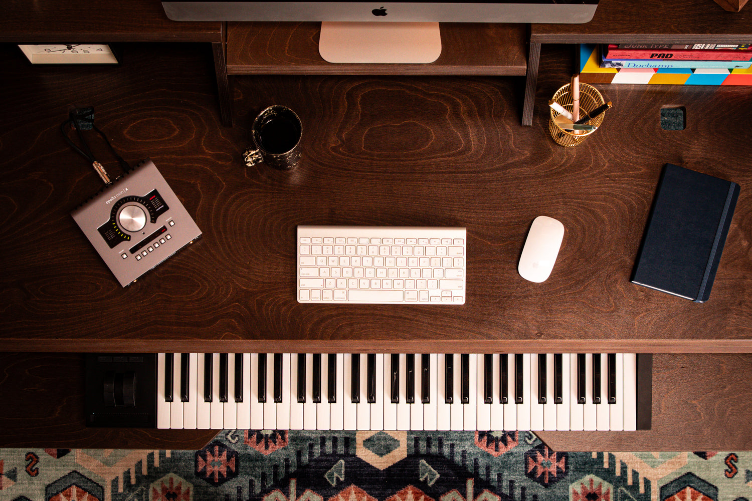
Keyboard Tray
When we designed the original Platform, we did some research and figured that about half of our customers would want the keyboard tray, so we designed the desk for the tray to be an option, and keep the entry price lower. To keep the intent of the industrial design with an add-on tray, we would have to somewhat compromise on the width of the tray to keep the tray in between the legs, and due to certain mechanical tolerances exceeding the tolerances of material thickness, hang the tray from the desktop, further eroding the width. However, it turns out that we were very wrong in our initial assumption, and nearly everyone (over 95%) ordered the original Platform with a keyboard tray.
Armed with this knowledge, we were able to update the design to incorporate the tray into the standard desk. Doing this allowed for a cleaner side profile and removed complication from the assembly as well as the mechanical design. Most importantly, it allowed us to take advantage of the full width of the desk, adding nearly three inches of usable width, and increase the robustness of the tray by attaching to the same support structure as the desktop, instead of hanging it from the desktop.
Desktop and Cable Management
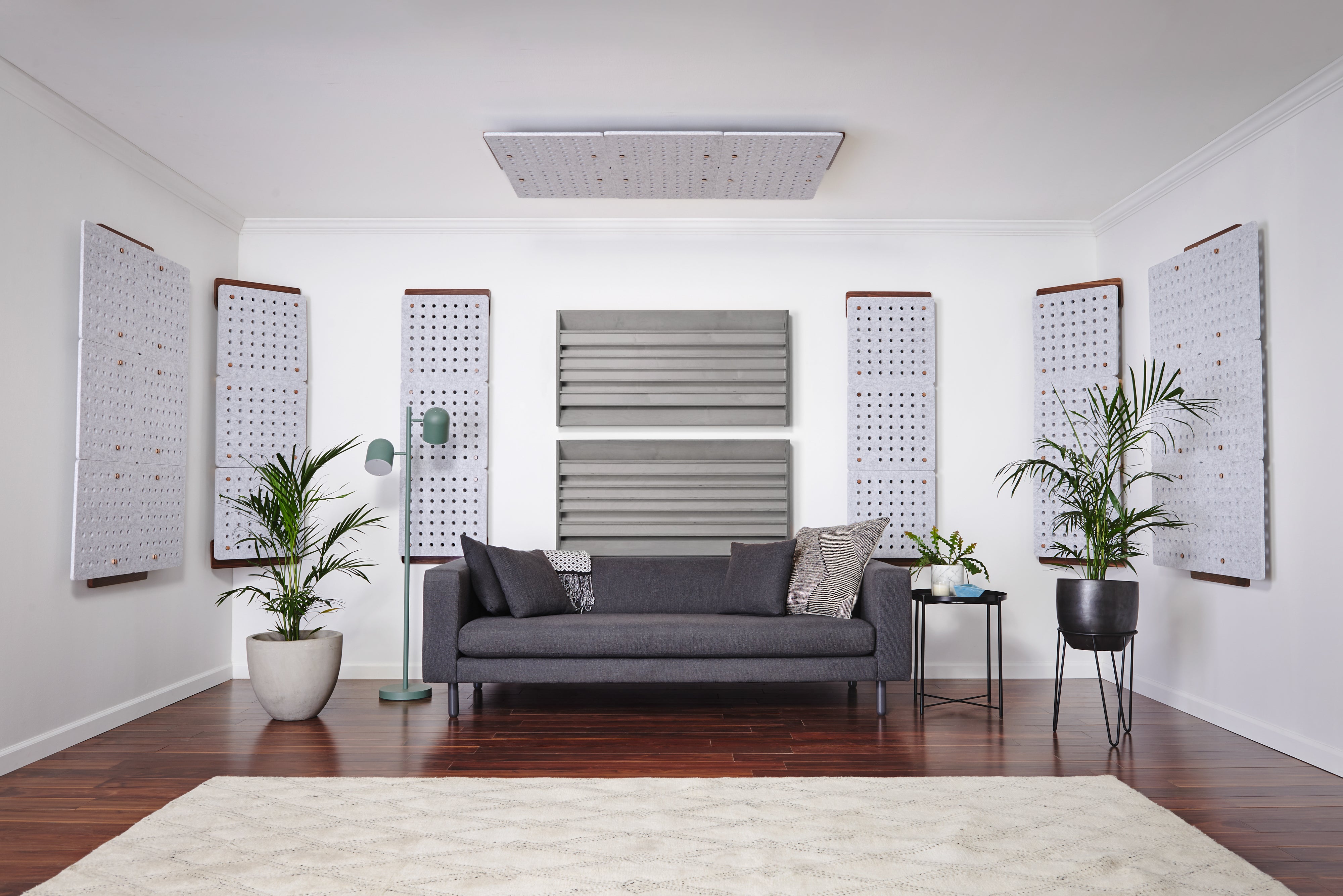
The first Platform was designed to be a studio desk that was usable whether or not there was racked gear in place. Because of that, the desktop extended past the legs behind to have a surface to hang the cable deck from. We designed holes in the back of the top to allow access to the deck below. Through our own experience and user feedback, we discovered that all the extended desktop did was clutter the side profile look, and make it really hard to access the cable deck from the front of the desk. In general, producers were not utilizing the back portion of the desk under the bridge. To access the cable deck, users would either need to crawl under the desk, climb on it to reach from behind (not recommended), or move it. This design also restricted air flow to any racked gear.
To address this issue, we tiered the desktop into two levels, with the top desktop ending within the outer leg, and the lower part of the desktop right below acting as the cable deck. This not only gives a much larger and more usable cable deck, it allows easy access from the front of the desk without any awkward contortions. It cleans up the profile look of the desk, and gives racked gear more airflow. We made sure that the desktop is still deep enough to be usable for most gear that doesn’t need racked, including hard drives and hubs.
All of the cutouts leading to the lower tier are designed to corral cables hanging from above, and the cutouts in the deck to corral cables to hang down the legs. We created gaps in the deck to allow for zip and velcro ties. All of the holes leading to and from different levels and the deck have been slightly enlarged to allow for almost any plug type, and to be able to poke some fingers through while snaking cables.
Ergonomics
On the first Platform, we went by the book with ergonomics. Literally (The Measure of a Man & Woman, Revised Edition, Human Factors in Design by Henry Dreyfuss Associates). However, the book was written before super high resolution 27” displays, and plugin fonts the size of microfiche. These displays also tend to have stands that do not allow for vertical adjustment. All of this conspired to make the display higher than many musicians and producers preferred when placed on the bridge.
To solve this issue, we designed the new bridge to have three levels, or be able to be removed entirely. This flexibility allows for an assortment of displays to be placed onto the bridge without having to look up at them.
The depth of the keyboard tray and how far it extends has also been updated to have the same usable space, but be a bit more compact, which puts everything on the work surfaces and racks within easier reach. It’s also reversible, so if the user would prefer to not have the knee cutout and have a QWERTY at the front of the deck, they can do that.
Conclusion
We tackled all of the details with the next generation Platform, and incorporated feedback from music makers and producers on every piece of the desk. Not a single wood piece is the same, yet it pays homage to the industrial design that put it on the map, and makes no compromise to the original vision. We even kept the reversible dividers. We took an already strong and robust design, and made it even stronger. In addition, we took into consideration feedback on assembly, and made that easier, down to engraving L & R into the parts where it applies. We’re excited to bring this update to market, and are excited for producers, video editors and music makers to experience our ethos to never settle.